Introduction
As we navigate through the digital landscape, minimalism continues to dominate design conversations, yet there remains a fundamental tension at its core. Designers and users alike often find themselves at the crossroads of functional minimalism and aesthetic minimalism two approaches that share a name but pursue different goals. This exploration aims to distinguish between truly functional minimalist design that enhances usability and purely aesthetic approaches that prioritize visual simplicity, while addressing why minimalism remains critically relevant in today's interface design.
Two Faces of Minimalism
Functional Minimalism: Design with Purpose
Functional minimalism focuses on reducing elements to their essential purpose, eliminating redundancy to enhance usability and efficiency. This approach prioritizes user needs above all else, asking: Does this element serve a necessary function?
At its core, functional minimalism is driven by the desire to streamline user experiences and reduce cognitive load. It's closely aligned with Hick's Law, which states that the more choices a person is presented with, the more time they need to make a decision. By reducing options and simplifying interactions, functional minimalism aims to optimize the user's decision-making process.
Functional minimalists believe that duplicating functions creates unnecessary complexity. For example, they might question the need for a separate alarm clock when a smartphone can fulfill the same purpose effectively. Every element in a functional minimalist design serves a clear and deliberate purpose, avoiding unnecessary decoration or elements that don't contribute to the overall function.
The benefits of functional minimalism extend beyond mere efficiency. Research indicates that reducing unnecessary options can lead to greater user satisfaction, faster task completion, and reduced decision fatigue. In a world of information overload, functional minimalism offers users a respite a clear path to accomplishing their goals without distraction.
Aesthetic Minimalism: The Beauty of Simplicity
In contrast, aesthetic minimalism is primarily concerned with visual appearance and emotional response. This approach embraces clean layouts, ample whitespace, and restrained color palettes to create visually uncluttered interfaces.
Aesthetic minimalists appreciate minimalism for its visual harmony and the serene, uncluttered environment it creates. They value monochromatic color schemes and simple, clean lines that can transform a chaotic space into a peaceful sanctuary. For them, the reduced number of items in a space allows each piece to receive more attention and appreciation, elevating everyday objects to artwork.
In digital design, aesthetic minimalism manifests through the use of white space, limited color palettes, bold typography, and flat design elements. These designs often evoke a sense of calm and modernity that many brands find appealing as a visual identity.
It's important to note that aesthetic minimalism isn't merely ornamental, it does serve psychological purposes. Clean, uncluttered designs can create an environment that feels orderly and well-managed, which can be psychologically pleasing to users. The visual simplicity can also help establish brand identity and create memorable user experiences.
The Intersection and Tension Between Approaches
The relationship between functional and aesthetic minimalism is complex and sometimes contradictory. While both aim to reduce complexity, they often prioritize different aspects of the user experience.
At times, these approaches align perfectly. Consider Netflix's Skip Intro button - a feature praised for its minimalist brilliance. It solves a real user problem (the annoyance of sitting through repeated TV intros) with an elegantly simple solution. The button appears only when needed, respects viewer choice, and enhances the overall experience. This exemplifies minimalism that is both functional and aesthetically pleasing.
However, tensions arise when aesthetic simplicity compromises usability. A design might look beautifully minimal while hiding necessary functions in unintuitive menus or removing helpful visual cues. Similarly, a highly functional interface might appear cluttered or unappealing if aesthetic considerations are ignored.
An interesting perspective emerged in one discussion: why not blend the two ideals and hold beauty as a necessary function. This suggests that aesthetics itself can be considered functional when it enhances the overall user experience - challenging the traditional dichotomy between form and function.
The debate between functional and aesthetic minimalism mirrors a broader discussion about whether form follows function or whether beauty itself serves an important purpose. Many users have expressed preferences for more skeuomorphic designs with personality, while companies often lean toward minimalism for practical reasons such as easier implementation and accessibility.
Case Studies: Minimalism in Luxury Brand Digital Experiences
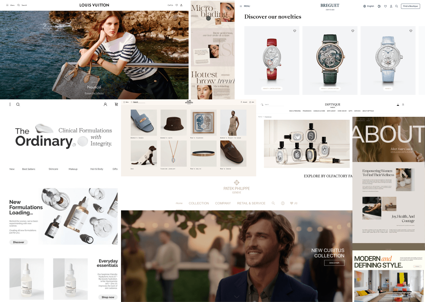
Louis Vuitton: Strategic Digital Minimalism

Louis Vuitton's approach to digital design exemplifies how luxury brands can leverage minimalism to enhance their online presence while maintaining their prestigious brand identity. Their website and email marketing strategy demonstrate a careful balance between functional and aesthetic minimalism.
The Louis Vuitton digital experience places products at the center of their strategy. Rather than relying on flashy design elements or complex layouts, the brand allows its iconic products to speak for themselves. This product-centric approach aligns with both functional minimalism (by focusing user attention on what matters most) and aesthetic minimalism (by creating a clean, uncluttered visual environment).
In their email marketing, Louis Vuitton follows the minimalist formula common among luxury brands: a clean logo header, simplified navigation, hero image, brief descriptive text, and strategic CTAs. This stripped-down approach serves both practical purposes (ensuring consistent display across email clients) and brand positioning (reinforcing the brand's exclusive, refined image).
The UX design of Louis Vuitton's e-commerce platform has been carefully crafted to balance simplicity with usability. First benchmarked in April 2021 and reviewed again in February 2024, the brand's digital presence demonstrates how minimalism can be leveraged to create a premium shopping experience that aligns with the brand's values.
Hermès: Digital Transformation Through Minimalist Excellence

Hermès stands as a pioneer in luxury eCommerce, having launched their first online store in 2001. Their 2017 digital transformation initiative demonstrates how minimalism can be leveraged as a core component of a brand's digital evolution.
The Hermès website embodies the brand's dedication to craftsmanship through a minimalist digital experience that mirrors the careful attention to detail found in their physical products. By treating their digital presence as an extension of their retail philosophy, Hermès has transformed eCommerce into a characteristic of the brand itself rather than merely another sales channel.
Hermès' digital design reflects what fashion critics describe as modern day minimalism in the most luxurious form imaginable. Their website creates a seamless shopping experience that prioritizes product visualization while maintaining the brand's sophisticated aesthetic through clean layouts, strategic use of white space, and restrained typography.
Jil Sander: Bold Minimalism in Digital Design
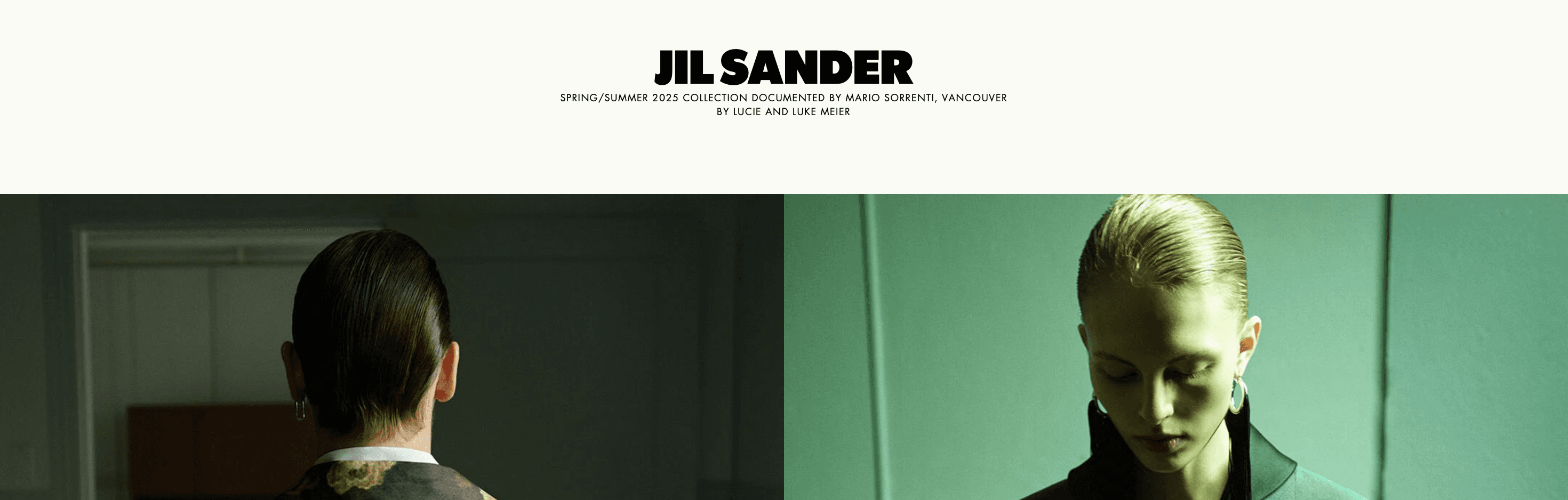
Jil Sander's website offers a fascinating study in how minimalism can be both bold and understated simultaneously. The brand's digital presence reflects its fashion philosophy of clean lines and understated sophistication.
What makes Jil Sander's approach distinctive is how it employs bold typography and an experimental, contemporary layout while maintaining minimalist principles. The website uses a grayscale color palette to express the brand's boldness and luxury, demonstrating that minimalism doesn't have to mean timidity or lack of personality.
By creating a unique design that highlights the boldness and elegance of wearing Jil Sander's clothing, the website shows how even distinctive pieces can make a strong statement within a minimalist framework. This approach successfully balances functionality (showcasing products effectively) with aesthetic considerations (expressing the brand's creative vision).
The Row: Invisible Luxury Through Digital Minimalism
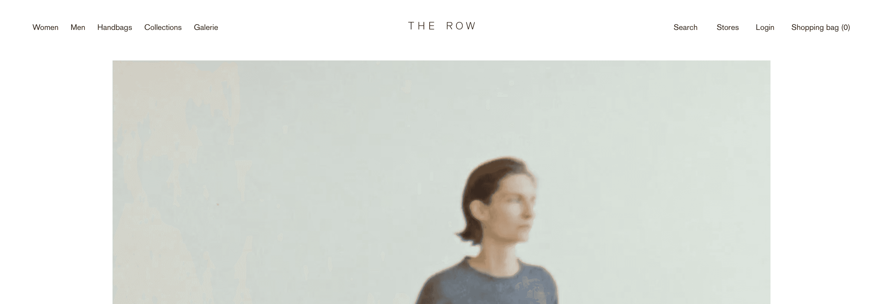
The Row, founded by Mary-Kate and Ashley Olsen, has built its identity around elevated, beautiful quality basics without flashy branding. Their digital presence extends this philosophy, offering an online experience that embodies invisible luxury.
What distinguishes The Row's approach is its commitment to minimalism not just as an aesthetic choice but as a core brand value. Their website avoids visible logos, monograms, or loud patterns that immediately signal luxury pricing, instead allowing quality and craftsmanship to speak for themselves.
This strategy represents a fascinating counterpoint in the luxury digital landscape, where many brands rely on recognizable visual signatures. The Row demonstrates how functional minimalism (focusing purely on product quality and user experience) can itself become a powerful form of brand differentiation in the luxury market.
Principles for Effective Minimalist Design
Finding the Balance Between Form and Function
Successful minimalist design requires thoughtful consideration of both functional and aesthetic elements. Here are key principles to achieve this balance:
Prioritize Essential Content and Functionality
Every element should serve a purpose. As one design principle states: Only include essential content - Content is the main focus and the interfaces are simplified. This requires ruthless editing and a clear understanding of user priorities.
Before removing elements, designers should question: Is this truly unnecessary, or does it serve an important function for users? The goal is not minimalism for its own sake, but rather to enhance the user experience by reducing distractions.
Strategic Use of White Space
White space (or negative space) is a cornerstone of minimalist design, creating visual breathing room that allows users to focus on key content. However, white space should be deployed strategically rather than arbitrarily.
Effective use of white space creates clear visual hierarchies, separates content sections, and improves readability. It's not just about aesthetics - proper spacing can significantly impact comprehension and navigation efficiency.
Thoughtful Color and Typography
Minimalist design often employs a limited color palette to maintain simplicity and coherence. This approach makes the strategic use of contrast more important, helping to create focal points and guide the user's attention to key elements.
Typography plays a crucial role in minimalist interfaces, with bold and expressive minimal typography often becoming a central design element. Clean, readable fonts with clear hierarchies can communicate effectively without requiring additional visual elements.
Intentional User Flows and Interactions
Design user journeys with purpose. Each step in the user's path should feel logical and necessary, minimizing the number of steps required to complete tasks. Use clear, consistent navigation patterns that feel natural whether the user taps, swipes, or clicks.
Polish and Refinement
One of the biggest risks in minimalist design is appearing "lazy" rather than intentionally minimal. True minimalism requires meticulous attention to detail and refinement.
As one designer noted, minimalist UI design should consider: Do the buttons have an effect on down over/down/up? Is the spacing even everywhere, is the text crisp? Are the colours used consistent, are they NICE colours? Do elements line up? These details distinguish thoughtful minimalism from designs that simply lack effort.
Common Pitfalls in Minimalist Design
When Minimalism Goes Wrong
Minimalist design, while powerful when executed properly, can easily miss the mark. Here are common pitfalls to avoid:
Confusing Emptiness with Purposeful Minimalism
A truly minimalist design isn't simply empty - it's carefully curated. As one expert noted, Lazy faux - minimalism happens when you start with nothing and try to add very little. To get true minimalism, you need to start with everything you think you need, then take away until you can't remove anything else.
Sacrificing Usability for Visual Simplicity
Never remove important information in the name of minimalism or bury critical functionality deep in nested menus. The primary goal should always be to serve user needs effectively.
Lack of Visual Interest or Brand Personality
While minimalism values simplicity, this doesn't mean designs should be boring or generic. Adding small, unobtrusive animations and sound effects can bring a minimalist UI to life without compromising its clean aesthetic.
Ignoring Accessibility Considerations
Minimalist designs must still be accessible to all users. High contrast between text and background, clear navigation patterns, and proper element sizing are essential accessibility considerations that align well with minimalist principles.
The Future of Minimalist Design
Evolving Beyond the Binary
As we move forward in 2025, minimalism in interface design continues to evolve beyond the simple dichotomy of functional versus aesthetic. Several emerging trends suggest the future direction:
Integration with Advanced Technologies
The integration of minimalist UX design principles in AI-driven systems is becoming increasingly important. Research shows that by focusing on refining user interfaces through detailed analysis of user interactions and behavior, minimalist approaches can ensure that AI systems are not only functional but also intuitive and accessible.
The challenge for designers will be maintaining minimalist principles while leveraging increasingly complex technological capabilities—finding ways to make advanced functionality feel simple and accessible.
Contextual Minimalism
Rather than applying minimalism uniformly, future interfaces may adapt their level of detail and complexity based on user context, needs, and preferences. This smart minimalism would provide simplicity when appropriate but offer additional information and controls when needed.
Emotional Minimalism
Beyond functional and aesthetic considerations, designers are increasingly considering the emotional impact of minimalist design. Research indicates that thoughtful minimalist designs can evoke positive emotions and contribute to users' mental well-being by reducing digital overwhelm.
Digital minimalism in UX design is increasingly focused on creating experiences that respect users' time and attention, potentially improving mental well-being by helping them reclaim their focus in a world that constantly competes for both.
Conclusion: Meaningful Minimalism for Modern Interfaces
The distinction between functional and aesthetic minimalism remains relevant in 2025 because it highlights the dual purposes of design: to work well and to create meaningful experiences. The most successful digital products achieve both.
Truly effective minimalism isn't about dogmatically removing elements for the sake of simplicity - it's about thoughtfully determining what's essential for users and presenting it in the clearest, most elegant way possible. This requires deep understanding of user needs, careful attention to detail, and continuous refinement based on feedback and behaviour.
As interfaces continue to evolve with new technologies and changing user expectations, the principles of meaningful minimalism - focusing on what truly matters, reducing cognitive load, and creating visually harmonious experiences - will remain valuable guides for designers seeking to create products that are both useful and beautiful.
The challenge and opportunity for today's designers is to move beyond the false dichotomy of function versus aesthetics and instead embrace a holistic approach that recognizes how these aspects complement and enhance each other in creating exceptional user experiences.
References
G & Co. (2024). "Hermès, an eCommerce Case Study." Retrieved from https://www.g-co.agency/insights/hermes-an-ecommerce-case-study
Reddit. (2023). "The peculiar case of japanese web design. must read." Retrieved from https://www.reddit.com/r/webdev/comments/z7ozgq/the_peculiar_case_of_japanese_web_design_must_read/
Standard. (2016). "Hermes showcases modern day minimalism in the most luxurious form imaginable at Paris Fashion Week." Retrieved from https://www.standard.co.uk/lifestyle/fashion/hermes-showcases-modern-day-minimalism-in-the-most-luxurious-form-imaginable-at-paris-fashion-week-a3198136.html
Reddit. (2024). "I'm terrible at Web Design, how do I make my website look good?" Retrieved from https://www.reddit.com/r/webdev/comments/1d8gus9/im_terrible_at_web_design_how_do_i_make_my/
Abduzeedo. (2024). "Studio Messa's Minimalist Web Design: A Masterclass in Elegance." Retrieved from https://abduzeedo.com/studio-messas-minimalist-web-design-masterclass-elegance
G & Co. (2024). "Hermès, an eCommerce Case Study." Retrieved from https://www.g-co.agency/insights/hermes-an-ecommerce-case-study
Reddit. (2021). "What are your thoughts on The Row and minimalist luxury brands?" Retrieved from https://www.reddit.com/r/femalefashionadvice/comments/mb829f/what_are_your_thoughts_on_the_row_and_minimalist/
G & Co. (2024). "Louis Vuitton, a Digital Advertising & Strategy Case Study." Retrieved from https://www.g-co.agency/insights/louis-vuitton-advertising-strategy-case-study
Baymard Institute. (2024). "Louis Vuitton UX Case Study." Retrieved from https://baymard.com/ux-benchmark/case-studies/louis-vuitton
Reddit. (2024). "EMAIL/DIGITAL DESIGNERS: What do you think the reason is behind the increasingly minimalist style taking hold in luxury brand email marketing?" Retrieved from https://www.reddit.com/r/graphic_design/comments/18ts1ss/emaildigital_designers_what_do_you_think_the/
Dribbble. (2024). "Jil Sander - Luxury Fashion Shop Minimalist Website." Retrieved from https://dribbble.com/shots/24217202-Jil-Sander-Luxury-Fashion-Shop-Minimalist-Website-Home